Uptycs
About the project
Transforming the Uptycs Website to Align with a Cleaner, Evolving Brand
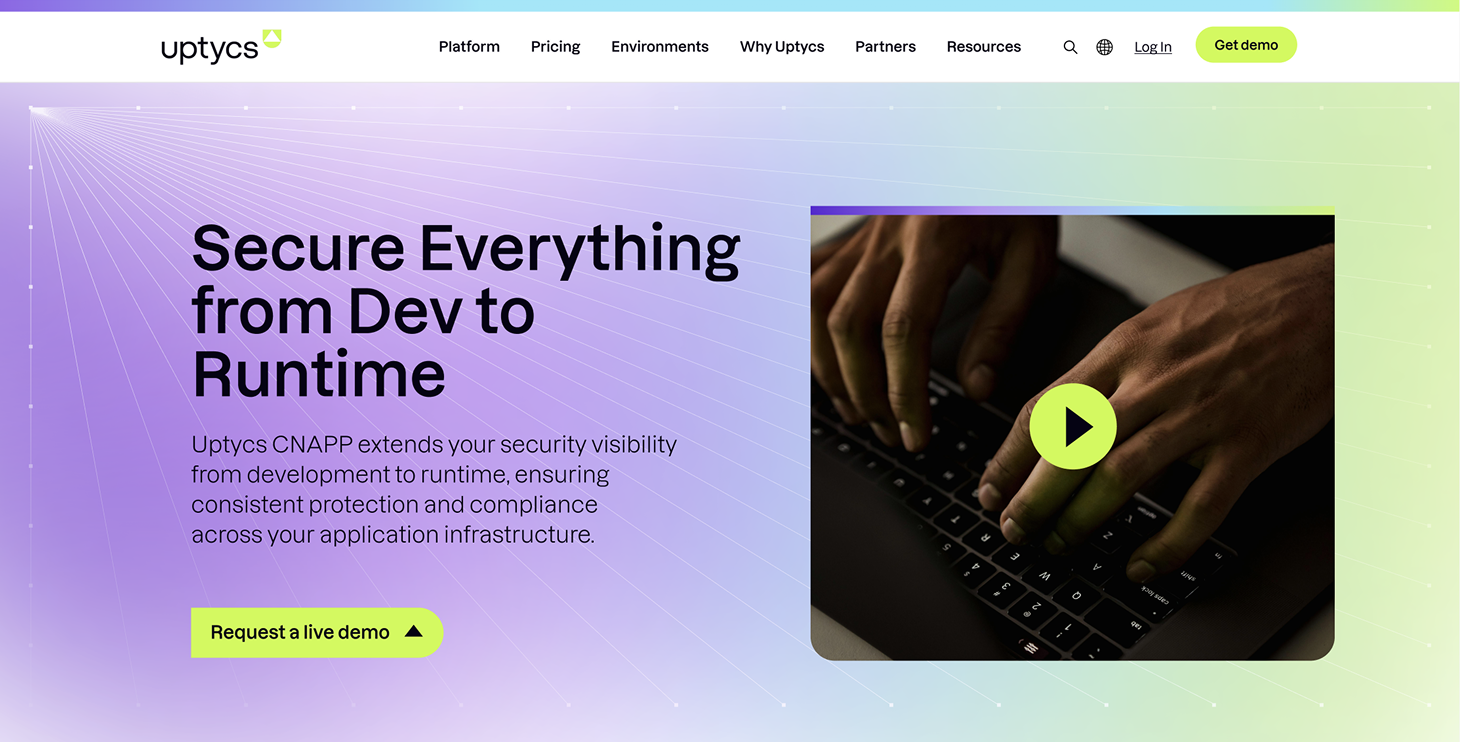
Uptycs came to us during an exciting moment of change—a soft rebrand that involved moving away from a dark, high-contrast style toward a cleaner, lighter visual identity. While it wasn’t a full redesign, it was a transformation that needed thoughtful execution.
Our approach was gradual: starting with high-impact pages like the homepage, we worked within existing structures to evolve the website. Using the new visual guidelines, we introduced a white background, incorporated updated gradients, and refined page layouts. Collaborating closely with Uptycs’ marketing team, we also built new landing and service pages with improved IA and conversion in mind—setting a strong foundation for the next chapter of their digital presence.
- CYBERSECURITY
.png?width=1246&height=653&name=Compliance%20(3).png)
.png?width=1246&height=653&name=Compliance%20(4).png)
The Challenge
This wasn’t a start-from-scratch redesign—it was a strategic shift. Uptycs was undergoing a soft rebrand and needed to evolve their website without disrupting everything at once. That meant balancing the old with the new: phasing in a lighter design language, reworking visuals and layouts, and introducing updated modules—all while keeping consistency across still-existing legacy pages.
.png)

The Solution
We began with the homepage, transitioning from a dark theme to a bright, modern look. We introduced lighter backgrounds, brand-consistent gradients, and fresh graphics to reflect the updated visual direction. Throughout the process, we worked in phases—updating high-impact pages first, then expanding to supporting pages. Alongside visual updates, we collaborated with Uptycs’ marketing team to design new landing and service pages optimized for conversion, using improved information architecture and flexible modules that could grow with the brand.
.png)
.png)
%20(1).png)
%20(2).png)
%201%20(2).png)

