.svg)
.svg)
Rebranding Kenniscentrum Persoonlijkheidsstoornissen:
professionalism, empathy, and impact.
Kenniscentrum Persoonlijkheidsstoornissen (KP) is a distinguished mental health network with an admirable mission and values. Unfortunately, their previous brand and digital presence didn’t reflect the unique, compassionate nature of their organization. This made it difficult for their key audience to find and recognize them online. WX engaged with its core team to rethink and uplift KP’s brand identity.
KP is a collaborative network comprising over 25 mental health care institutions. Their primary objective is to enhance the quality of care for patients with personality disorders by promoting knowledge dissemination, encouraging research, and initiating innovations.
In mental health care, balancing professionalism with empathy is paramount. But how do you translate this requirement to the colors and imagery, typography and messaging that constitute a brand? This is the challenge our branding team tackled for KP.
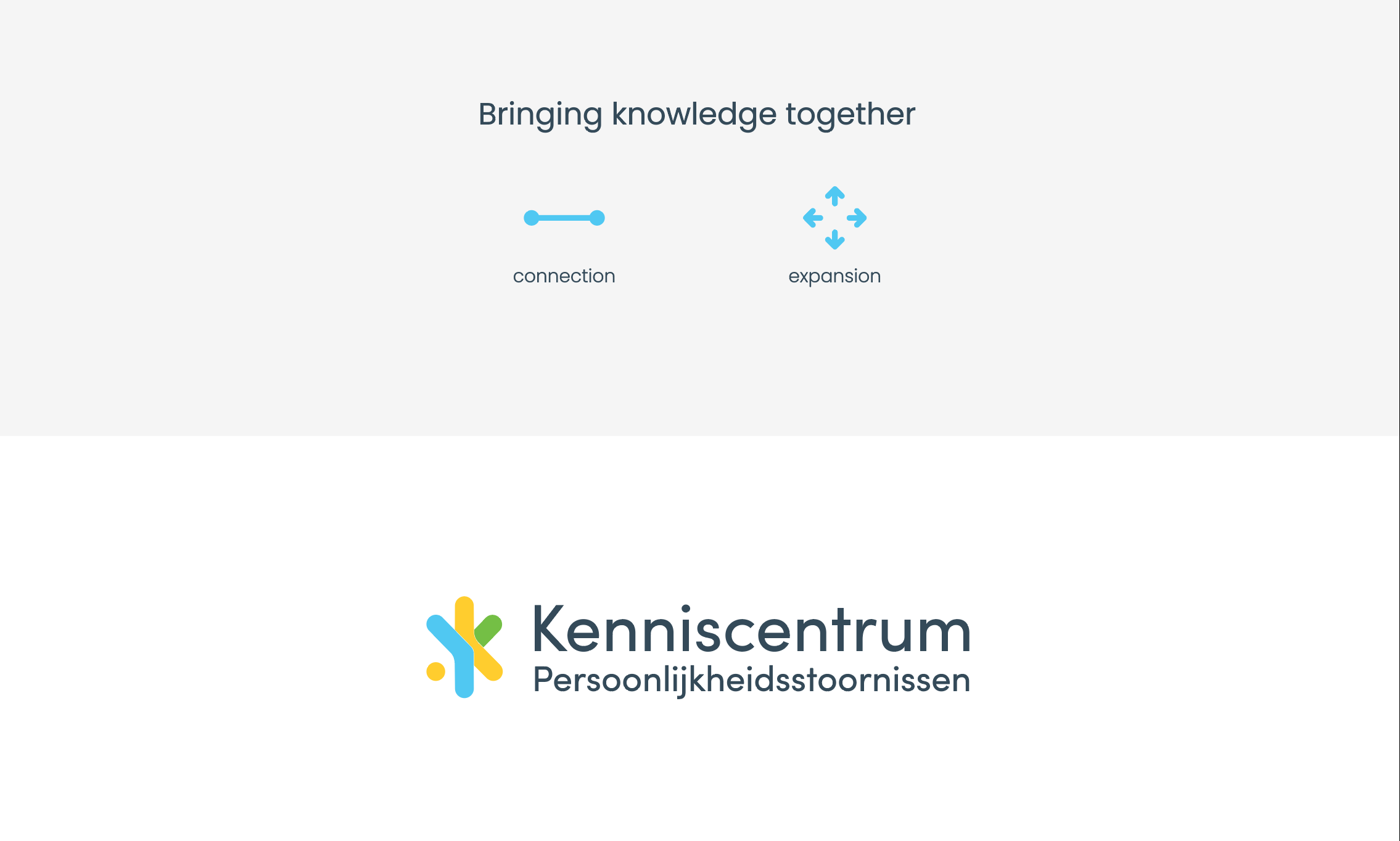
How do you create a brand that conveys its core values effectively?
A brand ultimately reflects the people who build and grow it. That's why we approach (re)branding projects with a collaborative mindset. Our joint effort with KP was no different: we worked hand-in-hand with their core team to ensure their values and vision were seamlessly translated into the new brand identity.
Brand Strategy
During our initial talks, we defined three strategic goals for the brand:
-
Emphasize KP's compassionate nature: by highlighting the empathy and warmth that KP brings to its community, the brand identity reflects its inherently compassionate nature.
-
Highlight KP's unique position: by emphasizing the intersection of keen professionalism and empathic compassion that sets KP apart from similar organizations, the brand becomes easily distinguishable.
-
Deliver consistent messaging: we aimed for a clear and cohesive brand message across all channels, fostering a strong connection with the audience.
To achieve these goals, we needed a logo that symbolizes key concepts and a visual language that genuinely resonates with the target audience of our client.
The end result is a highly recognizable logo with a modern look that exudes warmth. At the same time, the color palette and font selection work together to maintain a well-balanced, professional image.
-min-1.png)
Building the visual language
Although knowledge is a significant aspect of Kenniscentrum Persoonlijkheidsstoornissen’s work, its ultimate dedication lies in providing support to patients with personality disorders and their families. That’s why we aimed to create a visual language that embodies hope and authenticity.
By incorporating portraits of real people and everyday settings, the visual language ensured inclusive representation and normalized the perception of personality disorders.
Texture inspiration from the logo added depth and dimension to the visual language, while the distinctive brand colors bind together the visual elements and the brand identity.
By combining these crucial elements, we established a unique and meaningful visual identity for KP that fosters a sense of unity and recognition.
%20(1)-min.png)
Redesigning the website
Freshly revamped brand under the arm, we set out to optimize KP’s website. We again worked closely with KPs core team to define and maintain focus.
The key goal was to improve user experience and engagement throughout the website. To that end, we restructured the sitemap and reorganized the content. This not only made it easier for all visitors to find KP’s wealth of resources but also ensured that their diverse audiences could access information specific to their needs much quicker.
We also refined the UI design while also incorporating the brand's unique identity. In doing so, were able to create an intuitive user experience that was also visually appealing and engaging.
Successful brand transformation and website rework.
-min.png)
Kenniscentrum Persoonlijkheidsstoornissen now sports a highly recognizable digital presence thanks to the unique brand identity, and a user-friendly, engaging website. This combination works in tandem to provide a significant boost to KP’s mission of knowledge dissemination.