
HubSpot Modules Documentation
This page provides detailed information about various custom modules we have designed for the HubSpot CMS. Each module has been tested for responsiveness, customization flexibility, and seamless integration with the HubSpot Marketplace.
Events Listing (Pro module)
Overview
The Events Module is a dynamic and fully customizable module designed for HubSpot CMS. It allows users to showcase upcoming events with structured details, including the event's date, time, type, and location. The module offers customization options for background styling, spacing, and colors to align with brand aesthetics. It also supports a "More Events" button, linking to additional event details.
Features
-
Display multiple events with date, time, and location
-
Supports both online and offline events
-
Customizable heading, colors, and spacing
-
Background gradient support
-
Optional icons for time and location
-
"More Events" button with customizable link
-
Responsive design for desktop and mobile
Module Fields and Configuration
1. Style Group
These settings control the appearance of the module, including spacing, colors, and background settings.
| Field Name | Label | Type | Description |
|---|---|---|---|
desktop_spacing |
Desktop Spacing | Spacing | Adjusts the spacing for desktop views |
mobile_spacing |
Mobile Spacing | Spacing | Adjusts the spacing for mobile views |
background_color |
Background Color | Gradient | Sets a gradient background with configurable colors and direction |
heading_color |
Heading Color | Color | Defines the color of the heading text |
time_icon |
Time Icon | Image | Upload an image for the time icon representation |
location_icon |
Location Icon | Image | Upload an image for the location icon representation |
box_color_even_ |
Box Color (Even) | Color | Background color for even-numbered event boxes |
box_color_odd_ |
Box Color (Odd) | Color | Background color for odd-numbered event boxes |
2. Content Group
This section allows users to define the event details, including name, date, time, location, and event type.
Heading
| Field Name | Label | Type | Description |
heading |
Heading | Richtext | Displays the main heading for the event section (default: "Upcoming Events") |
Event Details
Each event has structured fields to capture all necessary information.
| Field Name | Label | Type | Description |
date.month |
Month | Text | Specifies the month of the event (e.g., "March") |
date.date |
Date | Text | Specifies the date or date range of the event (e.g., "22-25") |
event_name |
Event Name | Richtext | Name of the event, displayed prominently |
time |
Time | Text | Event timing, formatted as "HH:MM - HH:MM" |
event_type |
Event Type | Choice | Dropdown to select either "Online" or "Offline" event |
location.location |
Location | Text | Physical location of the offline event |
location.location_link |
Location Link | Link | Optional link for the event location (Google Maps, venue website, etc.) |
link |
Link | Link | External link for more event details |
link_text |
Link Text | Text | Custom label for the event details link (e.g., "More Info") |
3. Button Settings
Users can configure an optional button for redirecting visitors to a dedicated events page or external event registration.
| Field Name | Label | Type | Description |
button_required |
Button Required | Boolean | Toggle to show/hide the "More Events" button |
button_link |
Button Link | Link | URL for the button action (visible if button_required is enabled) |
button_text |
Button Text | Text | Custom text for the button label (default: "More Events") |
How to Use
-
Add the module to a HubSpot CMS page.
-
Customize the event details by adding or modifying event entries.
-
Adjust styling options such as colors, spacing, and background.
-
Configure the optional "More Events" button as needed.
-
Save and publish the page to make the event list live.
Notes
-
The location field is only visible if "Offline" is selected as the event type.
-
Background gradients can be adjusted with multiple colors and direction settings.
-
Ensure the date and time formats are used consistently for a professional display.
-
The module is mobile-responsive and adapts to different screen sizes.
Compatibility
-
HubSpot CMS Hub
-
Fully responsive on all devices
Submission Details
This module is designed for HubSpot CMS and follows HubSpot Marketplace guidelines. It offers flexibility for businesses to showcase upcoming events efficiently
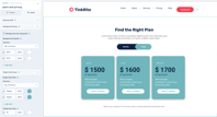
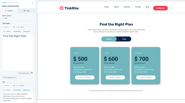
Plans & Pricing (Pro module)
Overview
The Plans and Pricing Module is a flexible and fully customizable module for HubSpot CMS, designed to showcase different pricing plans with structured details. It allows users to display multiple pricing tiers, including plan names, costs, features, and call-to-action buttons. The module offers customization options for background styling, spacing, and colors to align with brand aesthetics. Additionally, it supports a toggle switch for monthly and yearly pricing options, enhancing user experience.
Features
-
Flexible pricing for individuals, businesses, and enterprises
-
Choose from Basic, Pro, or Enterprise plans
-
Customizable features, including branding and styling options
-
Support for multiple pricing tiers with different feature sets
-
Optional add-ons for additional functionality
-
Easy upgrade or downgrade options
-
100% responsive design for all devices
Module Fields and Configuration
1. Style Group
These settings control the appearance of the module, including spacing, colors, and background settings.
also, we can update all the contents and button text and links to what we want.
How to Use
-
Add the module to a HubSpot CMS page.
-
Customize the pricing details by adding or modifying plan entries.
-
Adjust styling options such as colors, spacing, and background.
-
Configure the optional "Subscribe Now" or "Get Started" button as needed.
-
Save and publish the page to make the pricing details live.
Notes
-
Each plan includes customizable pricing, features, and CTA buttons.
-
Background gradients can be adjusted with multiple colors and direction settings.
-
Ensure pricing and feature details are updated accurately for customer clarity.
-
The module is mobile-responsive and adapts to different screen sizes.
Compatibility
-
HubSpot CMS Hub
-
Fully responsive on all devices
Submission Details
This module is designed for HubSpot CMS and follows HubSpot Marketplace guidelines. It offers flexibility for businesses to showcase pricing plans effectively.
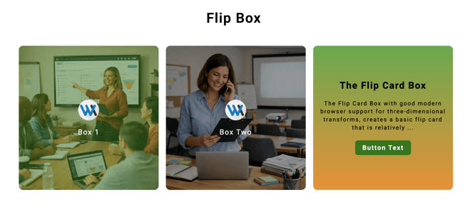
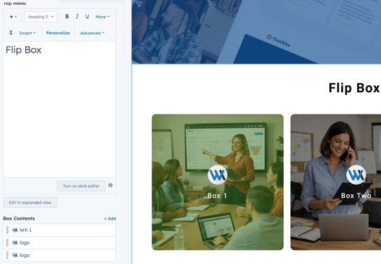
Flip Box (Pro module)
Overview
The Flip Box Module is a flexible, customizable HubSpot CMS module for interactive flip cards. It uses a front and back face inside a parent container, with the back face layered to match the front size for a smooth 3D flip.
Features
-
Fully customizable styling (colors, spacing, gradients, typography)
-
3D flip animation with smooth transitions
-
Responsive across desktop, tablet, and mobile
-
Flexible card layout (2, 3, or 4 cards per row)
-
Repeatable card content structure
-
Per-card CTA button/link support
-
Brand-friendly design controls
-
Front side background modes: Color or Image
-
Front image overlay color control
-
Optional hover lift effect with adjustable lift distance
-
Optional hover content color toggle for back content text
Module Fields and Configuration
Style Group
This group controls the overall visual appearance of the module.
Available settings:
- Background style (Gradient or Image)
- Top heading color
- Card content colors
- Button colors
- Spacing controls for desktop and mobile
Card Content Styles
This section manages the styling of card content on both the front and back sides.
Available settings:
- Front text color
- Back/rotation side background color
- Button background color
- Button text color
Premium Card Options
This group provides layout and animation controls for the card section.
Available settings:
- Number of cards per row (2 / 3 / 4)
- Card gap
- Minimum card height
- Card border radius
- Flip direction (Horizontal or Vertical)
- Flip animation duration
- Enable hover lift effect
- Hover lift distance
- Enable hover content color change
- Back content hover color
Content Group (Per Card)
This group contains the content and background settings for each individual card.
Available fields:
- Front side icon
- Front side content
- Front background type (Color or Image)
- Front background image
- Front image overlay color
- Front background color
- Back side content
- Button text and link
Notes
- Each card can be configured individually from the Content Group.
- Layout and interaction settings can be managed globally through Premium Card Options.
- Colors, spacing, and overall styling can be controlled from the Style Group for easier customization.
Add custom titles, icons/images, and text for both front and back sides
Option to display a button with editable text and links
How to Use
Add the Flip-Box Module to your HubSpot CMS page.
Customize content including front/back card text, CTA buttons, and icons.
Choose your layout (2, 3, or 4 cards).
Adjust style settings to match your brand (colors, spacing, alignment).
Save and publish your page.
Notes
All cards support both front and back content blocks.
You can duplicate cards easily with the repeatable item structure.
Gradients support multiple colors and angles.
Cards flip on hover or tap (mobile).
Responsive across all screen sizes.
Compatibility
Platform: HubSpot CMS Hub
Devices: Fully responsive on all screen sizes
Submission Details
This module adheres to HubSpot Marketplace guidelines and is optimized for performance, customization, and responsiveness. It's perfect for product/service highlights, team member profiles, feature cards, and more.
Countdown Timer by wx
Overview
The Countdown Timer is built to create excitement and urgency, keeping your audience engaged as they track the time remaining until a key event or deadline. Ideal for promotions, product launches, or important occasions, this module helps drive engagement and conversions by emphasizing time sensitivity. With a fully customizable design, it seamlessly blends into any website, aligning perfectly with your brand’s look and feel.
Features
End-of-time notification text – Automatically displays a custom message when the countdown ends.
Background gradient color option – Easily match your site’s theme and visual identity.
Customizable end date/time – Select any future date and time, and the module instantly starts the countdown.
Responsive design – Seamlessly adjusts to mobile, tablet, and desktop devices.
Modern typography and layout – Ensures visual clarity and elegance.
Live countdown timer – Accurate and auto-updating in real time.
Optimized performance – Lightweight and fast-loading for high engagement.
Module Fields and Configuration
Style Group
Controls the module’s appearance:
Color options
Padding and spacing
Background gradient and direction

Content Options
Add custom titles, images, and text for timer.
Pick the date and time you want the countdown to end.

How to Use
Add the Countdown timer by wx to your HubSpot CMS page.
Customize content including text, image, and background color.
Simply select any date and time, and the module will automatically generate the countdown.
When the selected date and time are reached, the module automatically changes to display a message notifying that the time is up.
You can customize the end-of-time notification message.
Save and publish your page.
Notes

Please add a unique ID if you’re using the module multiple times.
Easy Date and Time Setup
Gradients support multiple colors and angles.
Responsive across all screen sizes.
Compatibility
Platform: HubSpot CMS Hub
Devices: Fully responsive on all screen sizes
Submission Details
This module adheres to HubSpot Marketplace guidelines and is optimized for performance, customization, and responsiveness. It's perfect for product/service highlights, team member profiles, feature cards, and more.
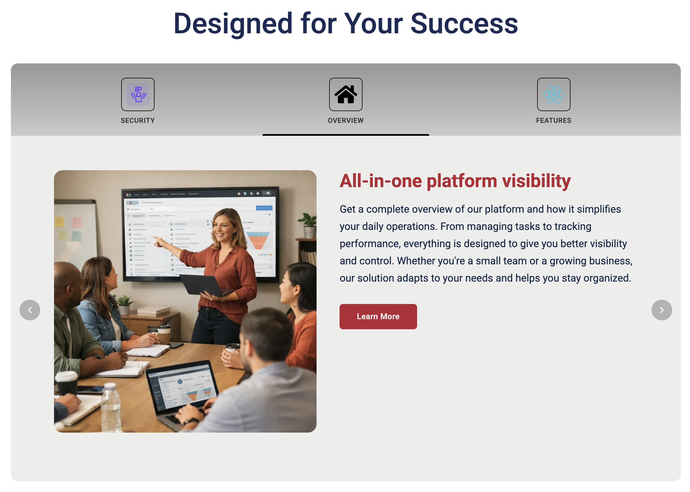
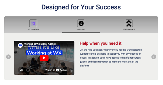
Circular tabs
Overview
The Circular Tabs module is designed to provide an engaging and interactive navigation experience. By combining circular tab icons with smooth sliding transitions, it enhances user interaction and makes content switching more intuitive.
Features
Navigation
- Icon + label-based tab navigation
- Support for SVG icons or custom images per tab
- Active tab indicators:
- Triangle
- Underline
- Highlight background
- Configurable number of visible tabs
Content
- Rich text content for each tab
- Multiple layout options:
- Stacked
- Side-by-side
- Media right
- Full-width
- Text-only
- Image customization:
- Border radius control
- Object fit options
- Max-width settings
- Video support:
- YouTube embed (auto URL conversion)
- Vimeo embed (auto URL conversion)
- CTA button per tab:
- Primary style
- Secondary style
- Outline style
Styling
- Icon customization:
- Size control
- Shape options (circle, rounded, square)
- Border & color settings
- Active tab styling:
- Background color
- Highlight color
- Typography controls:
- Title color
- Description color
- Tab label color
- Section background gradient support
- Spacing controls:
- Desktop spacing
- Mobile spacing
- Configurable border radius
- Theme color inheritance:
- Primary color
- Secondary color
Behaviour
- Auto-slide functionality with configurable speed
- Slide transition speed control
- Loop slides toggle
- Pause on hover option
- Navigation arrows toggle
- Mobile dots toggle
- Optional jQuery load toggle (for conflict prevention)
Responsive Design
- Tablet view: displays 3 tabs
- Mobile view: displays 1 tab
- Automatic stacked layout on smaller screens
- Mobile-optimized:
- Padding
- Font sizes
Module Fields and Configuration
Style Group
Controls the module’s appearance:
Color options
Padding and spacing
Background gradient and direction
Content Options
Add custom titles, color, and text for tabs.

How to Use
Add the Circular Tabs to your HubSpot CMS page.
Customize content including text, image, and background color.
You can easily manage the tabs by adding new ones or reordering them to fit your content flow. There is no restriction on the number of tabs, giving you complete flexibility to create as many sections as your project requires.
Save and publish your page.
Notes
Each tab is fully customizable, allowing you to add text, icons that perfectly aligns with your brand and content needs.
Responsive across all screen sizes.
Compatibility
Platform: HubSpot CMS Hub
Devices: Fully responsive on all screen sizes
Submission Details
This module adheres to HubSpot Marketplace guidelines and is optimized for performance, customization, and responsiveness. It's perfect for product/service highlights, team member profiles, feature cards, and more.
FAQ by WX
Overview
This FAQ module provides a clean and user-friendly way to present commonly asked questions and answers. It helps users quickly find the information they need while keeping the interface organized and intuitive.
Features
Background gradient color option – Easily match your site’s theme and visual identity.
Responsive design – Seamlessly adjusts to mobile, tablet, and desktop devices.
Unlimited accordian content – Add as many content sections as needed, with full flexibility.
Optimized performance – Lightweight and fast-loading for high engagement.
Enhanced user experience: Reduces support requests by providing instant access to helpful information.
Expandable/collapsible design: Allows users to open only the questions they care about, keeping the interface clutter-free.
Module Fields and Configuration
Style Group
Controls the module’s appearance:
Color options
Padding and spacing
Background gradient and direction

Content Options
Add custom titles, color, and text for accordion.

How to Use
Add the FAQ by WX to your HubSpot CMS page.
Customize content including text and background color.
You can easily manage the accordion by adding new ones or reordering them to fit your content flow. There is no restriction on the number of accordion.
Save and publish your page.
Notes
This module is ideal for websites and applications looking to improve self-service support while maintaining a polished, branded look.
Responsive across all screen sizes.
Compatibility
Platform: HubSpot CMS Hub
Devices: Fully responsive on all screen sizes
Submission Details
This module adheres to HubSpot Marketplace guidelines and is optimized for performance, customization, and responsiveness. It's perfect for product/service highlights, team member profiles, feature cards, and more.
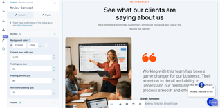
Review Carousel
Overview
The Review Carousel module is a dynamic and visually engaging way to showcase customer testimonials, client feedback, or success stories. Designed as a smooth slider, it helps build trust and credibility by highlighting real experiences in an interactive format.
With flexible styling options and responsive design, this module ensures your reviews look professional and compelling across all devices.
Features
Background gradient color option – Easily match your site’s theme and visual identity.
Responsive design – Seamlessly adjusts to mobile, tablet, and desktop devices.
Optimized performance – Lightweight and fast-loading for high engagement.
Scalable content – Add multiple review slides without affecting performance.
Interactive slider functionality – Smooth transitions between reviews for better engagement.
Enhanced user experience: Reduces support requests by providing instant access to helpful information.
Expandable/collapsible design: Allows users to open only the questions they care about, keeping the interface clutter-free.
Module Fields and Configuration
Style Group
- Background color
- Text color
- Content max width
- Padding (top, bottom, horizontal)
- Card and slide styling
- Image styling
- Navigation controls
Content Options
Easily manage testimonial content:
- Reviewer name and role
- Review text or quote
- Company or designation
- Image upload for each review
- Slide order and arrangement

How to Use
- Add the Review Carousel module to your HubSpot CMS page.
- Insert your testimonials, including text, names, and images.
- Customize styles such as background color, spacing, and typography.
- Adjust slider settings and navigation controls as needed.
- Save and publish your page.
Notes
This module is ideal for websites and applications looking to improve self-service support while maintaining a polished, branded look.
Responsive across all screen sizes.
Compatibility
Platform: HubSpot CMS Hub
Devices: Fully responsive on all screen sizes
Submission Details
This module adheres to HubSpot Marketplace guidelines and is optimized for performance, customization, and responsiveness. It's perfect for product/service highlights, team member profiles, feature cards, and more.
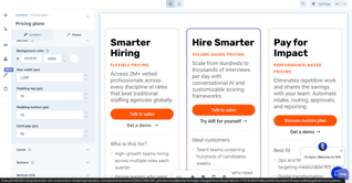
Our Pricing Plans
Overview
The Pricing Plans module is a modern and flexible way to showcase your pricing tiers, service packages, or product offerings. Designed with a clean card-based layout, it helps users easily compare options and take action through clear calls-to-action.
With extensive customization options and a fully responsive design, this module ensures your pricing section looks professional and consistent across all devices.
Features
- Fully customizable styling – Easily match your brand with background, text, and button color options.
- Responsive design – Optimized for mobile, tablet, and desktop devices.
- Flexible card layout – Display multiple pricing plans with adjustable spacing and layout.
- Scalable content – Add and manage multiple pricing cards using repeatable fields.
- CTA-focused design – Built to drive conversions with clear primary and secondary actions.
- Highlighted card option – Emphasize featured or recommended plans.
- Optimized performance – Lightweight and fast-loading structure.
Module Fields and Configuration
Style Group
- Background color
- Text and typography colors
- Content max width
- Section padding (top & bottom)
- Card layout and spacing
- Card styles (background, border, radius)
- Button styles and hover effects
- Responsive spacing settings
Content Options
Easily manage pricing content:
- Plan title and tagline
- Description text
- Primary CTA button (text & link)
- Secondary CTA link
- Feature/benefits list
- Optional section headings (e.g., Who is this for, Benefits, Outcomes)
- Bottom CTA title, description, and button

How to Use
- Add the Our Pricing Plans module to your HubSpot CMS page.
- Create pricing cards using the repeatable group field.
- Enter plan details such as title, description, and CTAs.
- Customize styles including colors, spacing, and layout.
- Configure the bottom CTA section if needed.
- Save and publish your page.
Notes
This module is ideal for websites and applications looking to improve self-service support while maintaining a polished, branded look.
Responsive across all screen sizes.
Compatibility
Platform: HubSpot CMS Hub
Devices: Fully responsive on all screen sizes
Submission Details
This module adheres to HubSpot Marketplace guidelines and is optimized for performance, customization, and responsiveness. It's perfect for product/service highlights, team member profiles, feature cards, and more.
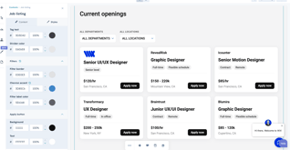
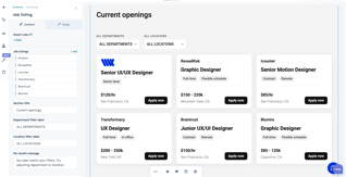
Our Job Listing
Overview
The Job Listing module is a modern and flexible way to showcase your open roles, career opportunities, and hiring needs. Built with a clean, card-based layout, it allows candidates to quickly browse, filter, and explore positions with ease.
With powerful filtering options and extensive customization controls, this module helps you create a professional and user-friendly careers section that works seamlessly across all devices.
Features
Smart filtering system – Allow users to filter jobs by Department and Location for faster discovery.Fully customizable styling – Match your brand with flexible background, text, and button color options.
Responsive design – Optimized for mobile, tablet, and desktop viewing.
Flexible card layout – Display job roles in a clean, organized grid with adjustable spacing.
Scalable content – Add and manage multiple job listings using repeatable fields.
CTA-focused design – Encourage applications with clear “Apply Now” buttons.
Tag-based highlights – Showcase job attributes like Full-time, Remote, Contract, etc.
Optional company branding – Show or hide company name and logo per listing.
Optimized performance – Lightweight structure for fast loading and smooth interactions.
Module Fields and Configuration
Style Group
- ackground color
- Text and typography colors
- Content max width
- Section padding (top & bottom)
- Card layout and spacing
- Card styles (background, border, radius)
- Tag and divider styling
- Button styles and hover effects
- Responsive spacing settings
Content Options
Easily manage pricing content:
- Company name and logo
- Job title
- Department and location
- Employment type (Full-time, Contract, Remote, etc.)
- Salary or compensation details
- Apply button (text & link)
- Custom tags (e.g., Senior level, Flexible schedule)
How to Use
- Add the Our Job Listing module to your HubSpot CMS page.
- Create job entries using the repeatable group field.
- Enter job details such as title, location, and employment type.
- Assign departments and locations for filtering.
- Customize styles including colors, spacing, and layout.
- Save and publish your page.
Notes
This module is ideal for companies looking to build a clean, professional careers page without external integrations.
Includes built-in filtering to improve user experience and job discovery.
Fully responsive across all screen sizes.
Compatibility
Platform: HubSpot CMS Hub
Devices: Fully responsive on all screen sizes
Submission Details
This module adheres to HubSpot Marketplace guidelines and is optimized for performance, customization, and responsiveness. It's perfect for product/service highlights, team member profiles, feature cards, and more.
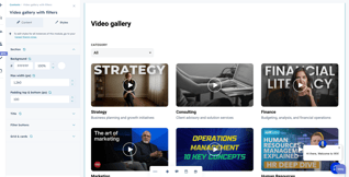
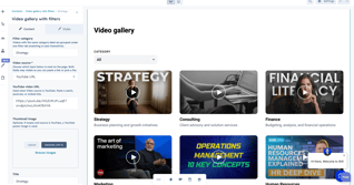
Video Gallery with Filters
Overview
The Video Gallery with Filters module is a modern and flexible solution for showcasing video content in an organized, user-friendly layout. Designed with built-in category filtering, this module allows visitors to quickly browse and discover videos based on topics, departments, services, or custom categories.
Whether you're displaying educational content, webinars, tutorials, case studies, or marketing videos, this module helps create an engaging and professional video experience across all devices.
Features
Smart Video Filtering
- Filter videos by custom categories
- Dynamic dropdown filter for easy navigation
- Automatically groups videos with matching category labels
- Case-insensitive category matching for simplified content management
Flexible Video Sources
- Add videos using:
- YouTube URLs
- HubSpot File Manager uploads
- Optional custom thumbnail image support
- Embedded video playback experience
Fully Customizable Design
- Background color customization
- Typography and text color controls
- Adjustable spacing and padding
- Grid and card layout customization
- Card styling options including borders, radius, and shadows
- Responsive sizing and alignment settings
Responsive Grid Layout
- Clean, modern card-based design
- Adjustable grid spacing and column layouts
- Optimized for desktop, tablet, and mobile devices
Easy Content Management
- Add and manage multiple videos using repeatable fields
- Configure video titles, descriptions, and categories
- Organized structure for scalable video libraries
Performance Optimized
- Lightweight and fast-loading structure
- Built for smooth browsing and playback experience
Module Fields and Configuration
Style Group
- Background color
- Content max width
- Section padding and spacing
- Title styling
- Filter dropdown/button styles
- Grid layout settings
- Card styling options
- Responsive spacing controls
Content Options
Easily manage video gallery content:
- Video source selection (YouTube or HubSpot file)
- YouTube video URL
- HubSpot uploaded video file
- Custom thumbnail image
- Video title
- Description text
- Filter category label
How to Use
- Add the Video Gallery with Filters module to your HubSpot CMS page.
- Add videos using either YouTube URLs or HubSpot uploaded files.
- Assign category labels for filtering.
- Customize thumbnails, titles, and descriptions.
- Adjust styles including colors, spacing, grid, and card layouts.
- Save and publish your page.
Notes
This module is ideal for:
- Educational video libraries
- Webinar collections
- Product tutorials
- Training resources
- Marketing and promotional videos
- Company knowledge hubs
Fully responsive and optimized for all screen sizes.
Compatibility
Platform: HubSpot CMS Hub
Devices: Fully responsive on all screen sizes
Submission Details
The Video Gallery with Filters module follows HubSpot Marketplace best practices and is optimized for flexibility, responsiveness, and performance. Its customizable filtering system and modern layout make it ideal for businesses looking to organize and showcase video content effectively.
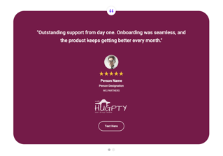
Simple Testimonial Slider
Overview
Simple Testimonial Slider is a powerful, lightweight testimonial module built exclusively for HubSpot CMS. Designed for marketers and developers who want a professional, fully branded social proof section — without the bloat of third-party libraries or the headaches of deprecated jQuery plugins.
Unlike most testimonial modules that rely on Slick, Owl Carousel, or jQuery, Simple Testimonial Slider runs on pure vanilla JavaScript with zero external dependencies. That means faster page loads, no console errors, no CDN failures, and full compatibility with modern HubSpot portals.
Features
Transition Options
Choose between two transition styles — a smooth horizontal Slide or a clean Fade crossfade — giving you full control over the feel of your testimonial section.
Drag, Swipe & Keyboard Navigation
Users can navigate testimonials naturally. Mouse drag works on desktop, touch swipe works on mobile, and arrow keys work for keyboard users — all built in with no extra configuration.
Autoplay
Enable autoplay with a configurable speed (in milliseconds). Autoplay automatically pauses when the user interacts with the slider and resumes cleanly after.
Navigation Dots
Toggleable dot indicators with fully customizable active and inactive colors. Each dot is accessible with proper ARIA labels.
Infinite Loop
Optionally enable continuous looping so the slider cycles endlessly without snapping back.
Per-Slide Testimonial Content
Each testimonial card supports: a custom quote icon image, rich text testimonial quote, person headshot (circular avatar), star rating (0–5 stars), person name, job title/designation, company name, company logo (with adjustable width and height), and an optional CTA button with custom text, link, and colors.
Full Style Control
Every visual element is editor-controlled: section background gradient, card background color per slide, card border radius, quote text color, person name color, designation color, star rating color, active/inactive dot colors, and CTA button text, background, and border colors.
Theme-Aware
The module inherits your HubSpot theme's primary and secondary colors out of the box, so it always feels on-brand — even across multiple portals or client accounts.
Responsive & Accessible
Optimized for all screen sizes with separate desktop and mobile spacing controls. Built with accessibility in mind — ARIA labels on navigation dots, star ratings, and interactive elements throughout.
No Dependencies. No Bloat. Just Results.
Drop it on any HubSpot landing page, site page, or blog and get a professional testimonial section that loads fast, looks sharp, and works everywhere.
How to Use
- Add the Simple Testimonial Slider module to your HubSpot CMS page.
- Add videos using either YouTube URLs or HubSpot uploaded files.
- Assign category labels for filtering.
- Customize thumbnails, titles, and descriptions.
- Adjust styles including colors, spacing, grid, and card layouts.
- Save and publish your page.
Compatibility
Platform: HubSpot CMS Hub
Devices: Fully responsive on all screen sizes
Submission Details
The Simple Testimonial Slider module follows HubSpot Marketplace best practices and is optimized for flexibility, responsiveness, and performance. Its customizable filtering system and modern layout make it ideal for businesses looking to organize and showcase video content effectively.
Stack Rotating
Overview
The Stack Rotating module is a modern and interactive hero section designed to showcase your product, service, platform, or digital solution with a bold visual impact. Built with a clean layout, animated rotating icons, CTA buttons, and flexible styling options, it helps create a strong first impression on any HubSpot CMS page.
With customizable content, editable icon items, and full design controls, this module is ideal for SaaS, technology, software, agency, and modern business websites.
Features
- Modern hero section – Display a strong headline, description, and call-to-action buttons in a clean layout.
- Rotating icon animation – Showcase technology logos, tools, platforms, or custom visuals with smooth rotating motion.
- Editable icon items – Update or replace icons directly from the module fields.
- Fully customizable styling – Match your brand with flexible background, border, text, and button color options.
- CTA-focused design – Add primary and secondary buttons to guide visitors toward key actions.
- Responsive design – Optimized for desktop, tablet, and mobile screen sizes.
- Flexible section layout – Control width, spacing, padding, and border radius from the HubSpot editor.
- Clean visual presentation – Combines content and motion graphics for a premium website experience.
Module Fields and Configuration
Style Group
- Background color
- Border color
- Content max width
- Section padding top and bottom
- Section border radius
- Heading color
- Body text color
- Button colors and styles
- Icon area styling
- Responsive spacing settings
Content Options
Easily manage pricing content:
- Main heading
- Description text
- Primary button text and link
- Secondary button text and link
- Main visual/icon image
- Rotating icon items
- Icon image upload or replacement
- Optional button visibility controls
How to Use
- Add the Stack Rotating module to your HubSpot CMS page.
- Update the heading and description text.
- Add or edit the primary and secondary CTA buttons.
- Upload or replace the rotating icons from the module fields.
- Customize the section colors, spacing, width, border, and typography.
- Preview the module across desktop, tablet, and mobile.
- Save and publish your page.
Notes
This module is ideal for creating a modern hero banner with animated visual elements.
The rotating icons can be customized to match your technology stack, services, tools, platforms, or brand visuals.
Fully responsive and suitable for homepage hero sections, product landing pages, service pages, and SaaS websites.
Compatibility
Platform: HubSpot CMS Hub
Devices: Fully responsive on all screen sizes
Submission Details
This module follows HubSpot Marketplace-friendly structure and is designed for performance, flexibility, customization, and responsiveness. It is perfect for modern hero banners, SaaS landing pages, technology service pages, software product sections, and agency websites.