.svg)
 3 minutes reading time
My search for outstanding, well-made or even decent web design in real estate development was a particular difficult one. I originally intended to mainly focus on the Latin-American real estate market, but quickly had to broaden my focus and shift my search worldwide.
The general conclusion I can make -after viewing hundreds of websites from property developers- is that the majority is outdated and probably not got much thought initially.
It’s literally a flashback to the 90’s, encountering clunky websites that are still using Flash (not supported by a lot of devices) or are unresponsive. The problem is not only visual though; a lot of the websites lack security measures, and this is especially dangerous when an ‘investor area’ comes in play.
Although this can make you and me fairly sad, there’s a great upside if you’re a developer or are in the business of real estate. Search engine competition rates are either low or medium -rarely high- and if you are serious about your business and are willing to invest in your brand and online presence, you can rather easily set yourself apart from 99% of your competition.
What follows is a varied selection of websites from real estate developers that catch the eye and with that visitor’s interest. They are selected because of their distinction in functionality, user experience, branding, conversion elements or overall design. All images link to the company's website.
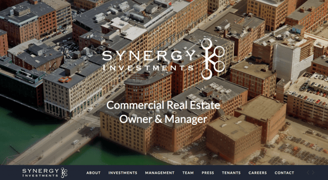
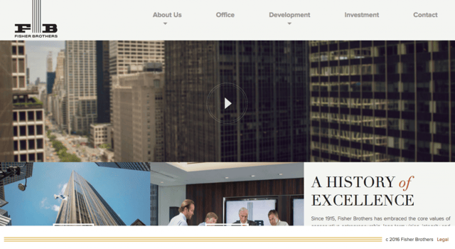
Although this design seems not very exciting, rather simple even, it has a clean single page design and a great header image to grasp attention. It’s easy to navigate thanks to the sticky menu and the display of press coverage and tenants help to showcase their extensive experience.
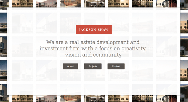
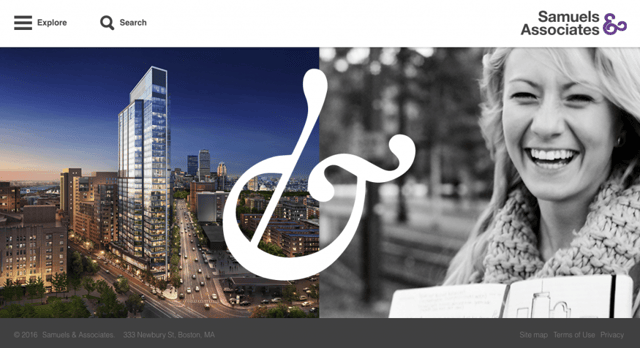
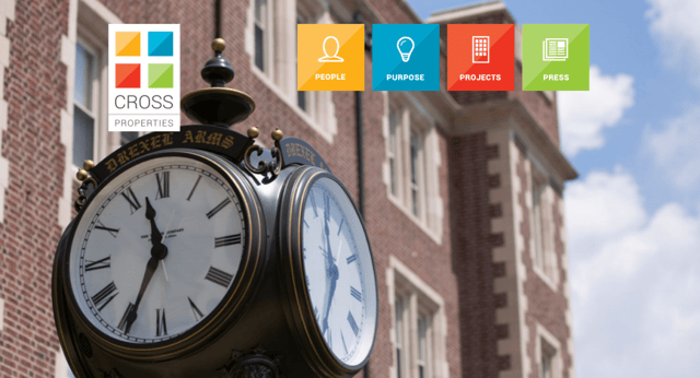
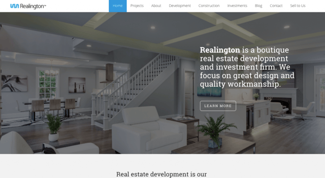
A unique design and great branding all around. From the page load, which shows projects fading in, all the way to illustrations that actually serve a function. It’s also smart to state the company purpose in the header and make use of testimonials.
This design is truly responsive as it works as smooth on mobile as it does on desktop. It’s unique, minimal and makes great use of the big bold font trend.
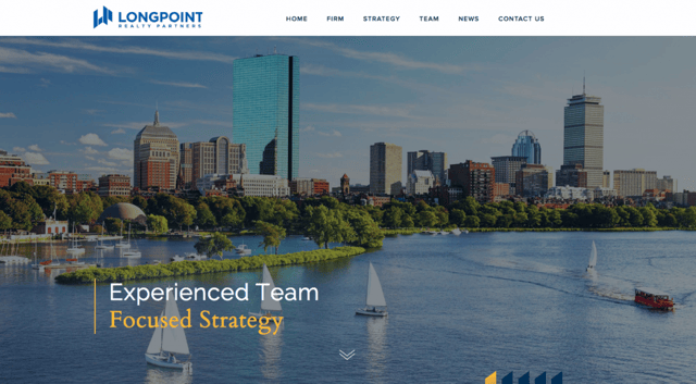
The color blue characterizes trust and stability. The charts and graphs help to convey a lot of information in a well-defined visual presentation. The subtle animations give it a dynamic touch.
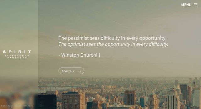
An unusual approach featuring a left sidebar with company logo. There is strong conversion focus, opening with an inspirational quote leading to the about page, which concludes with a call-to-action “let’s talk”.
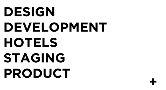
Again illustrations are used to quickly show important facts and numbers. Their portfolio page is very visual with a nice hover effect.
A good example that shows that minimal design doesn’t have to be cold or distant. The warm colors make you feel at home. When scrolling through their pages you notice how visually enjoyable the website is.
A visual website requires fast load times though, which can be achieved by a light framework and the right hosting infrastructure.
Branding with great storytelling as the pillar. The story is told throughout the entire website, however the perfectly integrated video header on the homepage tells the story best by being concise and engaging.
User Experience 10/10. The purpose page is so definite and to the point as well is their project presentation. A nice little touch is using the logo colors equally in the menu items.
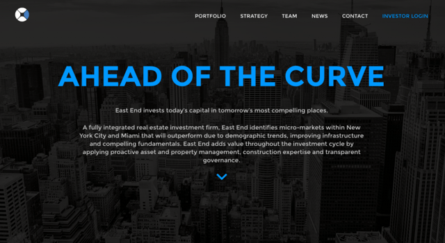
This real estate investment firm has a distinctive look. The tagline in bright blue is prominent and eye-catching. There’s little to no scrolling, an expandable story, and hovering over the projects nicely changes the full-screen background image.
Well, as minimal as it gets. It certainly makes it easy to navigate and gives it a unique feel, which represents the brand’s image.
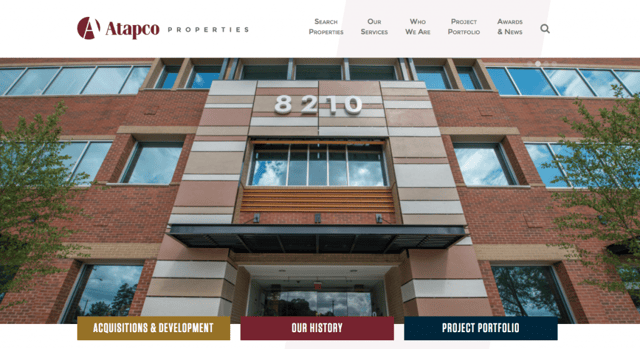
This design conveys a steady feel, nothing too fancy, but easy to use. The history page and project portfolio provide pleasant overviews.
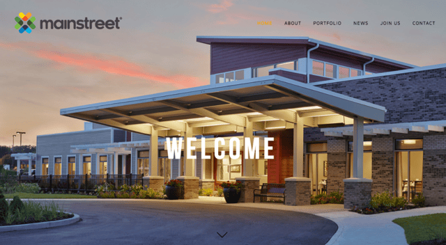
A modern but also a rather regular design. The full-screen visual header is becoming the gold standard. The other elements featuring a background picture really pop out through the good use of contrast.
We hope that this list will serve as a source of inspiration for everyone in real estate development industry. Although the designs mentioned contain distinctive features, there are some similarities of good practice that the majority shares:
- Fullscreen header image – an impressive image that shows the project at first glance.
- Minimalistic approach – they stick to what’s most important.
- Responsive design – deliver the same user experience across multiple devices.
Trends to action!
Contact us today to learn how we can take your website to the next level.
![[Web Design] How to use visual elements to structure and boost your website](https://www.wx.agency/hubfs/How-to-use-visual-elements-to-structure-and-boost-your-website.jpg)